
Visualizing Predictive AI
To mitigate the risk of premature UI feedback, I designed a modular, low-fidelity system that allowed us to isolate and validate core value propositions during discovery interviews. This strategic approach successfully de-risked the early product direction by ensuring every validated finding was anchored to a fundamental user need, not a preference for a specific button.
Client
SaferData.io
Sector
Consumer Analytics
Role
Designer
When
Q1, 2025
Duration
1 Month
Design Challenge & Strategy
The Problem: A Fragmented Research Approach
The challenge was to conduct discovery interviews that focused on user problems and desired solutions, rather than getting distracted by premature feedback on a full interface. We needed to visualize complexity without committing to a full interface. The goal was to isolate user-problem validation from UI preference, ensuring strategic alignment from the start.
The Solution: A Modular Prototype for Discovery
A 1-month discovery sprint defining the core user requirements for a novel Predictive AI platform for SaferData.io. This 1-month discovery sprint leveraged modular prototypes to uncover and validate 6 critical core feature requirements, establishing a high-confidence blueprint for both user needs and technical feasibility.
Strategic Blueprint: The validated core requirements served as the definitive blueprint for the engineering team, accelerating technical implementation and ensuring design vision was intrinsically linked to user insights.
Focus the conversation: This structure enabled us to drill down on specific pain points for data enrichment and exploration, rather than generic usability.
Validate core concepts: We confirmed our understanding of user pain points and their desired solutions without the distraction of premature design feedback.
Discovery Research
We conducted a comprehensive user research study to understand and validate key user needs. Our methodology was structured in two phases:
Contextual Inquiries revealed that the core foundational pain point was data upload and exploration friction, which became the first problem we prioritized solving with AI assistance.
Early Technical Validation: User flows were co-developed with the engineering team to ensure the AI data model’s delivery method was technically feasible from the outset, preventing costly downstream re-work.
White boarding: The inquires and stories were further detailed through a white boarding which was used to further refine functionality for each module and collaborate with engineers to determine feasibility and functionality.
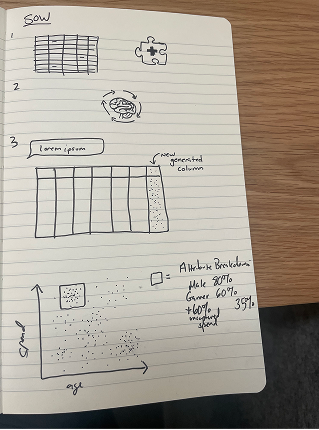
Ideation
Early sketches focused on translating engineering constraints for the AI model (e.g., latency vs. accuracy) into simple, actionable visual metaphors for the user. Sketching was paramount to help aid verbal discussion during ideation, and further drove the development of the end-user visualizations.
Delivery
A Framework for Success
This project’s final output was a structured framework of six core requirements for an advanced data analytics platform. This framework served a crucial dual purpose:
- Guiding User Validation: It provided a clear guide for conducting targeted user interviews, ensuring our concepts were validated by genuine user needs.
- Driving Technical Implementation: It acted as a clear blueprint for the technical team, directly informing the implementation and integration of interactive user data models within the SaferData system.
This approach ensured a seamless transition from research to development, aligning our design vision with technical feasibility and user expectations.
This process included:
Semi-Structured Interviews: We presented users with scenarios for data enrichment, augmentation, and synthesis. This allowed us to gauge the business value and relevance of these advanced capabilities.
Low-Fidelity Prototype Testing: We introduced a prototype of a conversational interface, asking users to pose their own business questions and react to probabilistic answers. This helped us assess their comprehension, trust, and readiness for a novel method of data interaction.
-
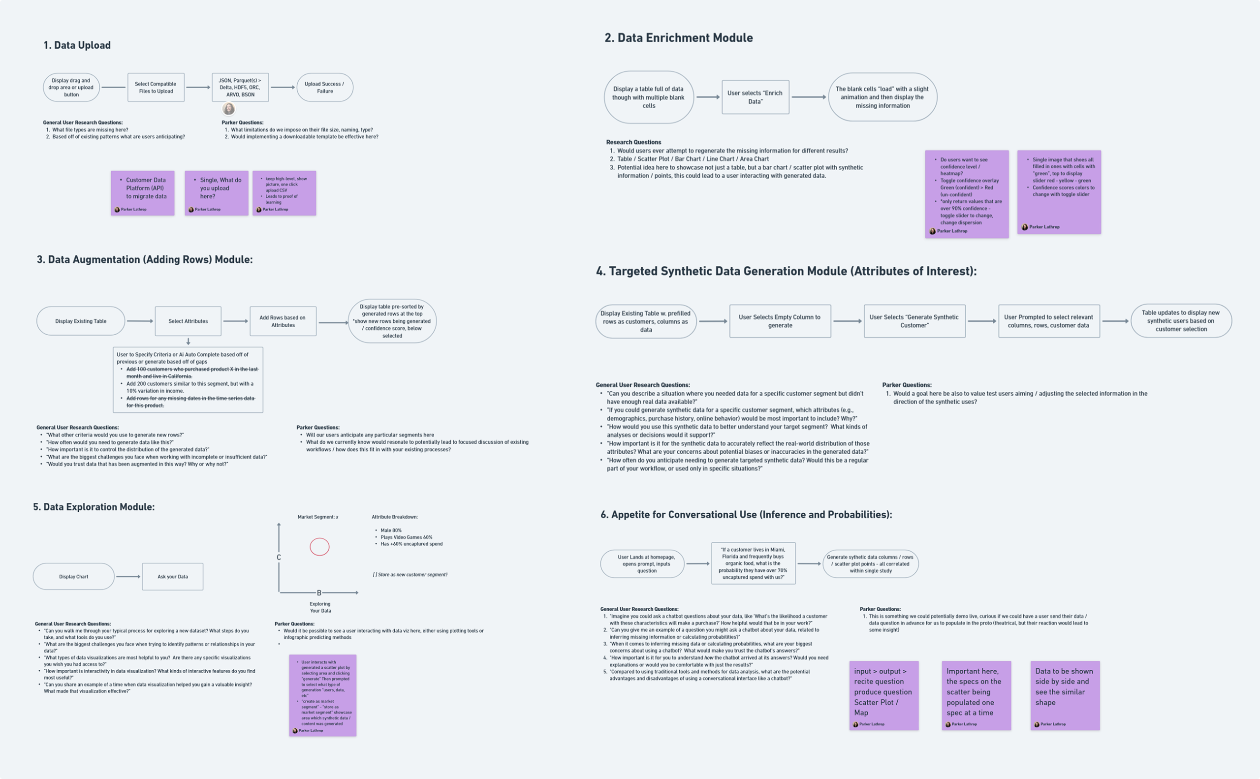
Enrichment Module
-
Data Augmentation
-
Targeted Synthetic Data
-
Exploration Module
-
Conversational Interface
-
Synthetic Data Population
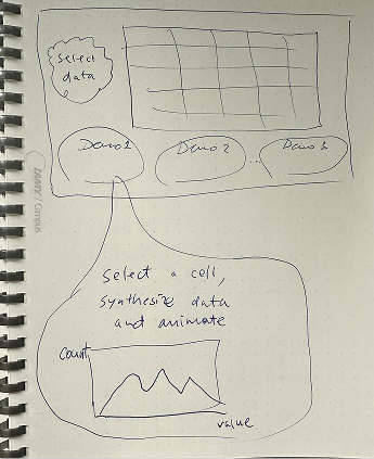
Problem: The Cost of Incomplete Data
Fragmented and incomplete datasets lead to stalled analyses and an estimated 30% loss in potential business insights due to critical missing values. The existing workaround—manually augmenting data or relying on disparate external tools—is time-intensive, adding an average of 4 hours to every analysis sprint and introducing workflow friction.
Integrated Solution Goal: Augmented Missing Data
Our goal was to validate and design an integrated, AI-driven feature that autonomously and intelligently populates these missing fields, transforming incomplete data into high-value analytical assets directly within the platform.
The core visualization was designed for data transparency and user control within the data table itself. When a missing cell is selected, the predicted value appears as an in-line, provisional overlay
Crucially, this is accompanied by a visual confidence bar or score adjacent to the prediction. This metric is the primary visualization, allowing users to trust and control the enrichment process before committing to the AI’s suggestion.
Hypothesis & Validation
We structured our inquiry around a core hypothesis: Automated enrichment of high-value data points will directly correlate with faster time-to-insight. To validate this, we sought to answer the following research questions:
- Which specific fields are most critically missing (e.g., credit scores, demographic data, industry codes) from a user’s typical dataset?
- What external or internal data sources do users currently **trust** for this type of data augmentation?
- Which enriched data points offer the **highest marginal business value** to the end-user?
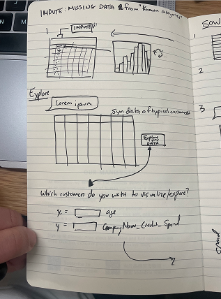
Problem: Segment Discovery Latency
Relying solely on existing, manually defined customer segments results in a stagnant and incomplete view of the market. High-value patterns and emergent customer groups are often buried in the data, invisible until a user spends significant time running complex queries or exporting to an external tool. This Segment Discovery Latency prevents businesses from quickly capitalizing on new opportunities, leading to suboptimal campaign performance and missed revenue potential from “unseen” customer bases. The user’s workflow is interrupted when a promising data pattern is identified (e.g., “high spend in restaurants”), but the platform lacks the actionable demographic segments to target it.
Integrated Solution Goal: Actionable AI-Driven Segmentation
Our goal was to integrate an AI-powered data augmentation feature directly into the data exploration interface. This solution uses machine learning to analyze the patterns identified by the user’s query (e.g., high-income, high-spend customers) and proactively suggests entirely new, descriptive segments that are currently missing from the database but exhibit high predictive value. The objective is to provide a frictionless, one-click path to augment the user’s customer intelligence, turning raw data insights (the pattern) into an actionable marketing target (the segment), thereby ensuring complete workflow continuity. The feature’s output is an immediate, actionable segment definition (e.g., “Female, New York Times Subscriber; Lives in Northeast US”) paired with a direct “Create New Segment” action.
Hypothesis & Validation
We hypothesized that the primary blocker to acting on data insights is the manual effort required to translate a data pattern into a defined, targetable segment. By providing this translation instantly, we could significantly increase the number of high-quality segments created and deployed.
We specifically tested the AI-driven segmentation feature to answer:
- How often does the AI’s suggested segment successfully capture a prominent pattern that existing, manually-created segments failed to isolate?
- What is the time-to-deployment difference when using the AI-suggested segment compared to a segment a user would manually define after identifying the same pattern?
- What is the lift in campaign conversion/performance when a campaign targets an AI-suggested segment versus a campaign targeting the original broad segment that prompted the discovery?
Problem: Insufficient Data for Targeted Modeling
A fundamental challenge in modern data science and marketing is the lack of robust, real-world data for specific, niche customer segments or for testing hypothetical, high-value scenarios. The available data may be sparse, biased, or too sensitive (due to privacy concerns) to use for extensive public model training and testing. This data deficit forces users to build models and strategies based on incomplete evidence, leading to unreliable predictions and a fear of “model drift” when applied to untested segments, such as a highly specific “Pacific Northwest, mid-credit score, high untapped spend” group.
Integrated Solution Goal: On-Demand Synthetic Segment Creation
The goal was to design an intuitive, step-by-step workflow that allows users to generate a synthetic, realistic dataset for any customer segment they can define. This feature mitigates data scarcity and privacy issues by creating artificial data points that accurately reflect the statistical properties and correlations of the user’s real database. The solution is embedded directly in the platform, allowing users to:
- Select Sources and Attributes (e.g., Customer Database, Age, Credit Score).
- Specify Target Values (e.g., Age 25-45, Location: Pacific NW, Model Data: Has > 70% Untapped Customer Spend).
- Generate a high-fidelity synthetic segment, complete with a Confidence Score to assure data quality.The final result is an actionable, testable segment that can be immediately deployed in modeling or comparison workflows, thus ensuring seamless workflow continuity.
Hypothesis & Validation
We hypothesized that empowering users to proactively generate data for underrepresented or hypothetical segments would significantly increase the speed and reliability of model development and scenario planning.
We specifically tested the Targeted Synthetic Data Generation feature to answer:
- How does the predictive accuracy of a model trained exclusively on a generated synthetic segment compare to one trained on a scarce real-world dataset for the same segment?
- What is the time savings realized by users who can generate a complex target segment’s data instantly, versus the time spent attempting to acquire or clean the real-world equivalent?
-
Does the presence of the Confidence Score (based on a statistical measure of similarity to the real-world data distribution) increase user trust and the rate of adoption of the newly generated synthetic segments?
Problem: Workflow Latency
The current workflow is highly fragmented: it forces users to export processed data to a separate, complex Business Intelligence (BI) tool for analysis. This disjointed process creates significant latency between data processing and insight discovery. Users urgently need a frictionless path to identify patterns and relationships at the moment of data access.
Integrated Solution Goal: Embedded Visualization Insight
Our goal was to design an embedded, in-flow visualization feature that facilitates immediate data exploration. This approach drastically reduces the time-to-insight, replaces the reliance on external BI tools, and ensures complete workflow continuity. This feature was centered on a dynamic, interactive scatter plot visualization.
Hypothesis & Validation
To ensure we designed a feature with genuine, immediate value, we anchored our research in user-centric validation, seeking to understand the habits and needs at the exact point data exploration typically begins.
We specifically tested the interactive scatter plot to answer:
- What are the most critical workflow and usability limitations of their existing external BI tools that we must address?
- What are their current go-to methods and habits for exploring data when attempting to identify patterns and relationships (e.g., using correlation plots)?
- What specific types of relationships or insights (e.g., correlation, causation, anomaly detection) are they most frequently looking for, and how effective is the interactive scatter plot in surfacing them?
Problem: Cognitive Load and AI Adoption
We validated that the greatest obstacle to Predictive AI adoption was not the model’s accuracy, but the high cognitive load imposed by complex technical interfaces. This complexity forced users into rigid, pre-defined query structures, creating a significant barrier to spontaneous data exploration and slowing the conversion of raw predictions into actionable business strategy.
Integrated Solution Goal: Conversational Interface for Data Query
Our solution was to design a novel Conversational Interface that radically simplifies data query and interaction. The goal was to lower the cognitive barrier to data access by enabling users to ask business-relevant questions in natural language, effortlessly transforming complex data and predictions into a stream of actionable insights.
The primary design element was a clear and immediate “Ask your Data” call-to-action, positioning the AI not as a tool to be configured, but as an assistant to be queried.
Hypothesis & Validation
We structured our validation around a core hypothesis: Replacing structured query with natural language interaction will significantly reduce cognitive load and increase the speed of insight generation.
To validate this approach and refine the interface’s capabilities, we focused on the following research questions:
- Trust & Comprehension: How do users react to probabilistic answers generated by the AI, and what level of transparency (e.g., confidence scores, source citations) is required for users to trust and act on the insights?
- Interaction Fidelity: What types of conversational phrasing are most common, and how robustly must the system handle ambiguity, follow-up questions, and contextual memory to feel genuinely helpful?
- Actionable Output: Beyond generating a written answer, what are the most valuable visualizations or suggested next steps (the “Action” component) that need to accompany the conversational insight?
Problem: Static Data Generation & Lack of Visual Feedback
Current synthetic data generation methods often operate as black boxes, providing users with a generated dataset without immediate, intuitive feedback on its distribution and quality. This lack of visual verification creates uncertainty about whether the synthetic data accurately reflects the desired patterns or diverges into unrealistic noise. Users are forced to rely solely on numerical metrics or to export and visualize the data in a separate tool, creating significant friction and a disjointed mental model for iterative data refinement.
Integrated Solution Goal: Real-time, Visually-Driven Synthetic Data Population
Our objective was to design an interactive scatter plot interface for generating synthetic data, providing real-time visual feedback during the generation process. This approach allows users to intuitively “see” the data as it populates, immediately identifying clusters, outliers, and overall distribution patterns. By integrating the generation directly with a visual output, users can:
- Define initial parameters.
- Observe the synthetic data points (e.g., in cyan) being generated.
- Visually identify how specific features or “target values” (e.g., highlighted in orange) are represented within the broader synthetic dataset.This method transforms a complex, abstract process into a transparent and guided experience, ensuring the generated data aligns precisely with their analytical goals and drastically improving user confidence and efficiency. The “Generating” button’s animated state further reinforces the live, responsive nature of the process.
Hypothesis & Validation
We hypothesized that providing immediate visual feedback on the distribution and characteristics of synthetically generated data would significantly enhance user confidence in the output and enable more precise, iterative refinement.
We specifically tested the Interactive Synthetic Data Population scatter plot to answer:
- How much faster can users identify and correct undesirable patterns (e.g., unexpected clusters, missing correlations) in synthetic data when given real-time visual feedback compared to post-generation numerical analysis?
- Does the visual representation of both general synthetic data and specific “target value” populations (e.g., cyan vs. orange points) improve a user’s understanding of the synthetic data’s fidelity to their intended distribution?
- What is the perceived “trustworthiness” of the synthetic data when it is generated and visualized interactively, as opposed to receiving a static, pre-generated file?

LearnPlatform

AI Nutrition