LearnPlatform Redesigned
How I lead the design effort to rebuild LearnPlatform using all new Instructure UI, WCAG AAA Compliance, and scalable interface.
Client
Instructure
Sector
EdTech
Role
Lead Designer
When
Q4, 2024
Duration
3 months
Context & Challenges
Context
After our acquisition, the LearnPlatform team was tasked with leading the redesign of our products’ user experience. We focused on establishing a new design language that would allow us to align seamlessly with other Instructure products like Canvas, Mastery Connect, and Parchment. While we had an existing design system and engineering framework, this effort was crucial for creating a cohesive product family.
Challenge
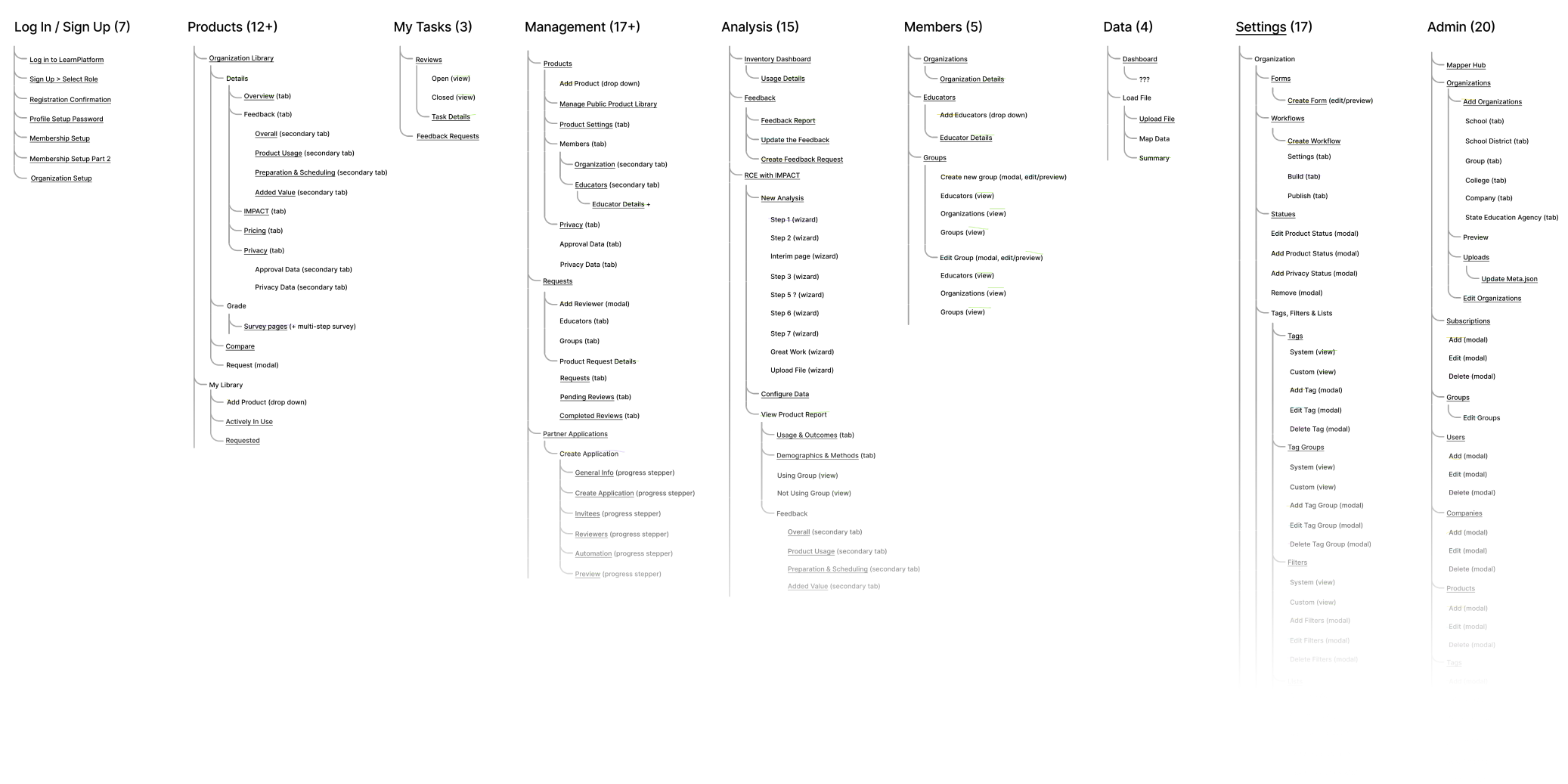
This meant that a 100+ of our pages required a redesign.
A full-scale redesign was necessary, extending beyond a simple UI refresh. We had to ensure that each of our pages could fully adopt the new Instructure UI while also maintaining or improving existing functionality. A key part of this effort was guaranteeing that all pages were mobile-friendly and WCAG AAA compliant.
Process
Our Framework
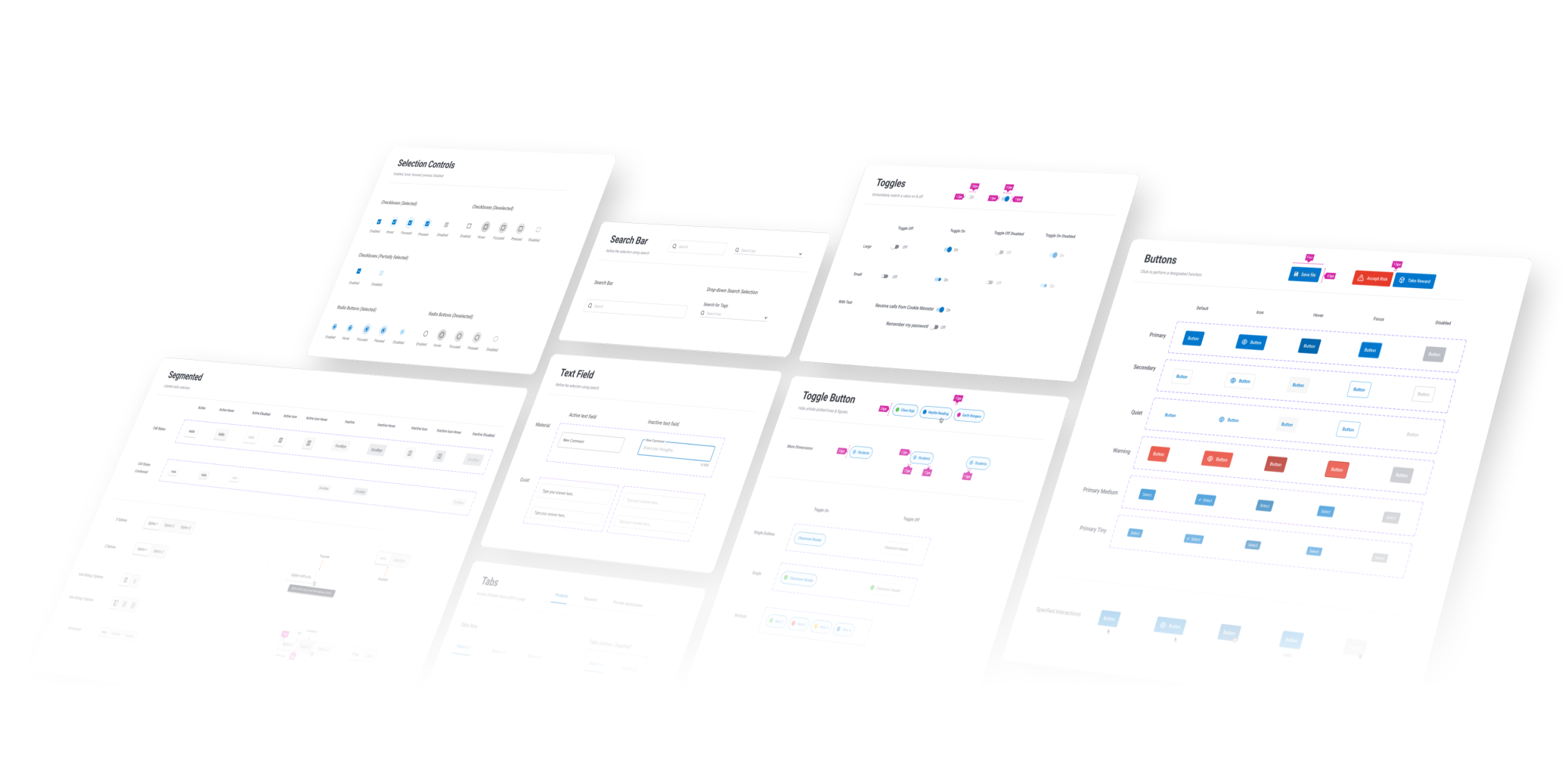
While we had a clear framework for swapping out basic UI components—like buttons, dropdowns, and toggles—we quickly ran into problems with more complex parts of our design. The true “bread and butter” of our product, including our navigation, color scheme, and tables, were largely undetermined in the new system. This meant we couldn’t just swap them out; we had to rethink these core features, which were not as straightforward as a simple button.
In addition to these changes, we collaborated with a third-party for an accessibility audit to highlight the areas of the platform that needed an additional layer of accessibility to reach WCAG AAA.
Our process looked something like this:
- Evaluate which pages were to receive priority
- Start with standard component swap, make accessibility changes
- Size with Engineering page/feature LOE
- Design review with stakeholders (PMs, Admins, Engineers, Accessibility Engineers)
- Engineering hand-off
- Rigorous design and accessibility QA
What you see here are some original LearnPlatform pages ready for redesign.
Additional Details
The strategy centered on standardization and efficiency across the board. This began with implementing a consistent design system (standard color palette) to ensure all data visualizations were visually uniform and accessible (A11y). To speed up development, the team optimized the engineering workflow by connecting Figma and development tools Storybook, which allowed for feature focus QA. For seamless project delivery, a process requiring detailed documentation (checklists and annotations) was established to keep all teams aligned. Finally, a mobile-first approach was adopted as a core design decision to make the product immediately responsive and future-proof.
Color
To solve the challenge of color and table consistency across over 50 data visualizations, I established a standard color palette. I collaborated with the accessibility (A11y) team to ensure the colors met all accessibility standards and were adaptable for use with Highcharts, including the use of patterns, as well as custom tags found throughout our platform.

Figma to Storybook
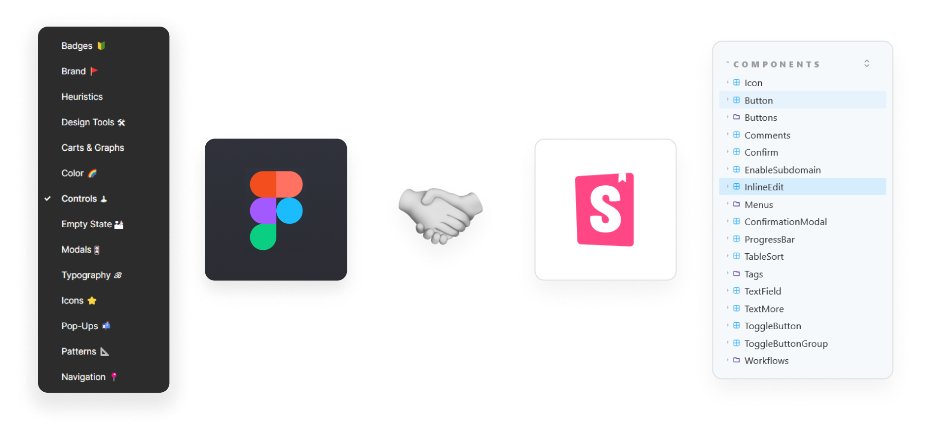
I streamlined our engineering workflow by establishing a connection between Figma components and Storybook. This process significantly reduced friction when building customized UI that fell outside our standard framework, resulting in a 45% decrease in development time.
Checklists, Annotations, Delivery
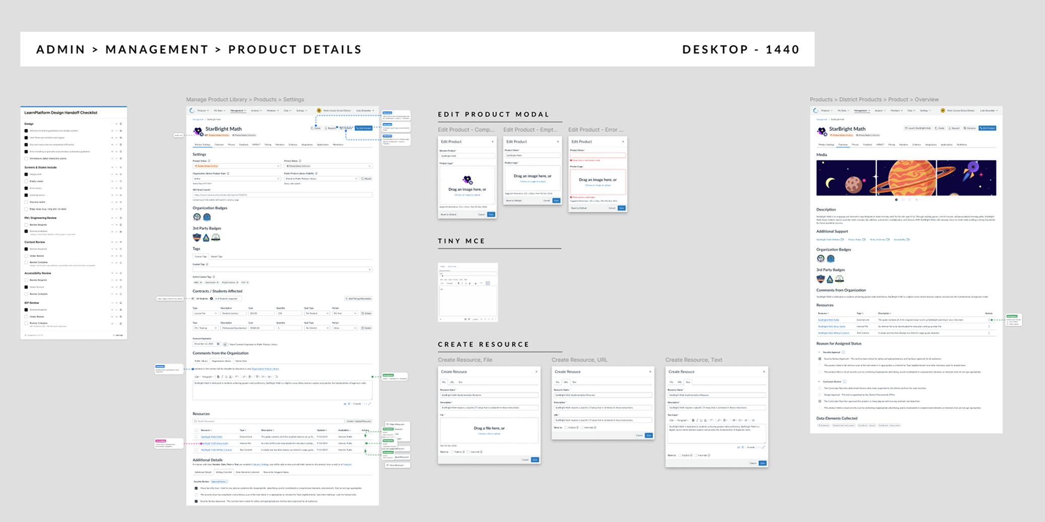
When delivering projects with over 100 pages, a coordinated handoff is essential. I use detailed checklists and annotations to ensure that all stakeholders, including the PM, developer, A11y engineer, and copywriter, have the necessary context to complete their tasks and maintain a shared understanding.
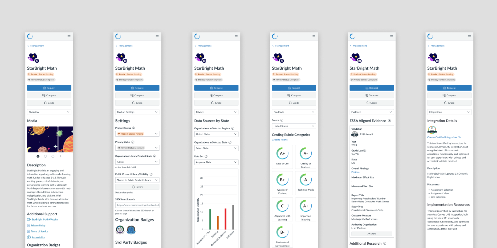
Mobile Design
With the new UI, I implemented a mobile-first design approach to ensure every screen was responsive across a variety of sizes. This strategy was crucial for both making the product more accessible to all users and for future-proofing our development.
Continuous Feedback
To ensure all parties could provide real-time feedback, I streamlined our process through frequent engineering standups, handoffs, and retros. This initiative allowed us to address potential issues before they became problems and fostered a culture of mutual accountability and productive collaboration.
Outcomes
Results & Learning
Upon completing the final designs for a project that included over 120+ pages, I delivered several major accomplishments:
- Redesigned and refined the login experience for all user types, including Educators, Admins, and Partners.
- Overhauled the upper navigation to improve usability.
- Completely redesigned core workflows, product comparison, feedback, and management functionality.
- Achieved WCAG AAA compliance by implementing a mobile-first display.
- Created onboarding flows to support structured change management and new user adoption.
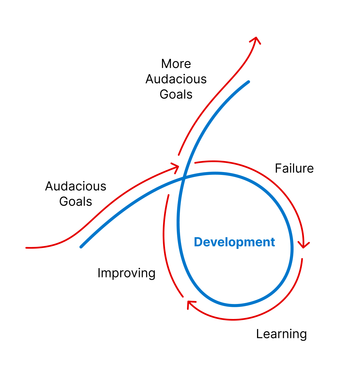
This project was a massive undertaking that involved a wide range of stakeholders. Through this experience, I learned that over communication is essential, and that a designer is responsible for proactively identifying and driving process improvements.
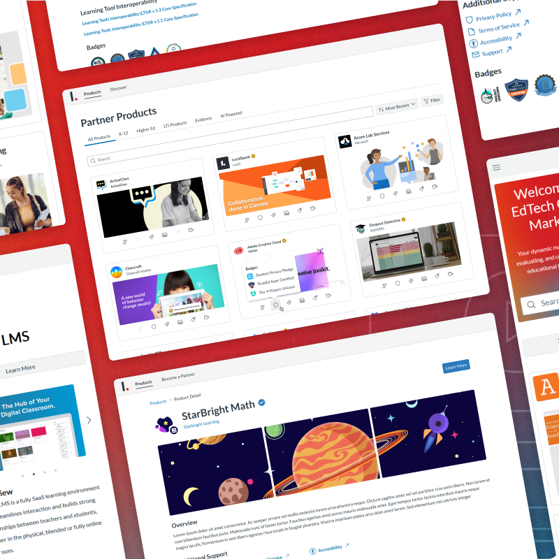
The EdTech Ecosystem
Visualizing Predictive AI